Fast Food and You
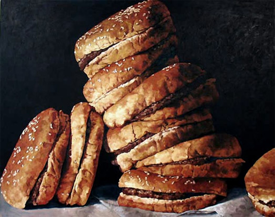
The painting shown here should make you think about what you consume. This painting, titled BURGERS II is a reminder about what we
are actually eating when we grab fast food. The painter, Pamela Michelle Johnson wants to show you what America is consuming and the
consequences of it.
The painting is obviously showcasing burgers, but upon closer inspection you begin to generate negative emotions towards it. This has to do
with the black background and the murkiness of the colors. The burgers are stacked on top of each other making the viewer feel over-whelmed and full by the
sight. The burgers are messy and not presented in a caring manner. The white of what appears to be napkins are a dingy grey color, suggesting grease from the
burgers. The burgers that are sideways, looking like they fell off the tower, are uncanny for still being “put together.”
All of these things make the burgers undesirable. The bad part is this is what most of the burgers we buy at a fast food places look like. When
was the last time you opened the wrapper to find your burger looking as good as the commercials? Probably never. Fast food chains are great for convenience,
hence the name “fast food”, but what are we giving up for this convenience? Is fast food so convenient we eat too much of
it?
The painting is trying to show us that fast food may be convenient but that’s about it. The size of the painting and the tower of
burgers represents the size of the portions we are eating now, which is way too much. The unappealing look to the burgers represents how bad they are for you.
The burgers that look like they fell off the leaning tower represent the tipping point between convenience and your health. As convenience rises, your
health decreases, your health are the fallen burgers. This image should make you think of what you are really putting into your body the next time you eat
fast food.
